10 Top Tips for Styling Children’s Spaces

  1. Apply wall stickers to add interest to a plain wall, specifically purchased wall decals make bland walls come alive!

  2. Personalise with prints- Add fun prints that can be changed as and when your child changes too

  3. Blinds- double up with a Blackout Roller Blind (for purpose) and combine with a beautiful Roman Blind to really style it out

  4. Frame their own pictures- Use a selection of frames and create a unique piece of wall art- Something you can then cherish for years and move to another room when they no longer want it in theirs #TooCoolForSchool

  5. Make tidying easy- Use large pretty lidded baskets, then there really is no excuses for keeping tidy, even when unexpected visitors arrive at short notice

  6. Stick with a theme for a cohesive look using wall art, bedding, accessories, rugs. Just be sure not to make it look too twee-Need any help with this?… You know where we are, its our speciality!

  7. Soft toy storage idea-Use an empty bean bag, stuff it full of all those soft toys that are cluttering up the place and gathering dust to create multifunctional hidden storage, providing a comfy seat to sit & relax as well as easy access to all those toys when the need arises 💕 #TheStruggleisReal

Top Tips for Sytling Children's Spaces | Morris Molloy Berkshire

8. A child’s bedroom needn’t look childish & can go on to last them for several years, it is the ideal place in any home to use bold bright colours so do be brave!

9. A colourful wall paper on a chimney breast or in a little nook creates interest. If you are not feeling quite that brave then simply add colourful painted shelves & try wallpapering inside cupboards

Top Tips for Sytling Children's Spaces | Morris Molloy Berkshire

10. Create a special reading corner for your little one using low level shelves, add a comfy bean bag & rug & encourage them to keep books to this area only! #GoodLuck

Top Tips for Sytling Children's Spaces | Morris Molloy Berkshire

When Fashion & Interiors Collaborate

We love it when Fashion  and Interior brands collaborate!  In the past more often than not it has been Fashion Designers that have turned their hand to Interiors however last Autumn we saw William Morris design a range of clothing for H&M and this Spring Superga and Farrow and Ball joined forces to create a brand new take on their 2750 Trainer and we just love the concept behind the design.  Read on for more details….

Farrow & Ball + Superga

Farrow & Ball + Superga

Farrow and Ball have taken every detail into consideration creating unique colours that only appear on the collaboration shoes, the foxing has been designed to replicate a classic Victorian skirting board and the shoes are lined with Farrow and Ball’s best-selling wallpaper design – Tessella (WOW!)

Each shoe has been designed by Farrow and Ball in the same way they would construct a room, taking in to consideration the colour of the floor, which represents the sole, skirting board, representing the foxing and the walls, representing the canvas. Each colour has been mixed in-house by Farrow and Ball. 

 The shoes are branded with ‘Farrow and Ball’ replacing the usual ‘Superga’ rubber heel branding, with their logo featuring on the left sock lining and Superga on the right.  How amazing is this?

Morris & Co + H&M

Morris & Co + H&M

As previously mentioned Last Autumn, H&M collaborated with Morris & Co, the quintessentially British interiors brand that was founded in 1861 by William Morris, one of the most influential designers of the Arts & Crafts Movement. The collection featured some of the most recognised archival prints in romantic yet tailored designs. Sourced from its vast archive, the Morris & Co prints used throughout the collection are some of the most iconic often seen on wallpaper and interior textiles.   Anyone who knows of William Morris will be able to spot his designs being worn on the high street, on the catwalk and even on screen.


Ok so we are not taking it away from the world of Fashion that they too have created some fabulous designs for some of our most loved Interior/homeware brands, such as the collaboration between Joules and DFS…

Joules + DFS

Joules + DFS

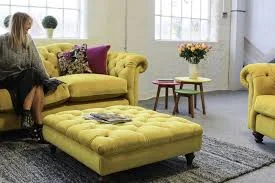
Yet another fabulous collaboration can be seen when British fashion and lifestyle brand Joules who are known for their use of floral prints, colour and stripes, extended their homeware range with the launch of its first-ever sofa collection in collaboration with DFS.

It includes a range of country, coastal and colour-inspired sofas, armchairs and footstools, with each piece designed to “embody the quality, Britishness, colour and humour that makes Joules stand out from the crowd,”

Each piece is made in the UK, and is available in array of fabric options and colours, and feature details such as colour-dipped feet, which we love!

Vivienne Westwood + Cole & Sons

Vivienne Westwood + Cole & Sons

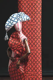
The last one we would like to shout out about is when the legendary Vivienne Westwood chose to take her designs from inside your wardrobe and onto the walls of your home. The designer's collaboration with Cole & Sons draws on her signature prints and patterns throughout her career, translating them into striking wallpaper designs.

"It is good when my ideas get carried over into other artistic media. This collection is a perfect opportunity to be able to work with a heritage company like Cole & Son and to see my ideas from fashion translated into the world of interiors and wallpaper," comments Westwood.

Here’s to many more fabulous collaborations in 2019 & beyond!

Oxfordshire Interior Designers do #LDW19AtDCCH

What happens when two Oxfordshire based Interior Designers (us) head to London for Design Week?

As always it starts with a mad dash for the train and we make our way to Paddington, nothing too eventful to report and we even manage to get a seat which is always a bonus these days.  We then take the District line Westbound to West Brompton & from there wait for an over ground train to Imperial Wharf, as we look around it is unmistakable that everyone else is also heading for the design show!  Yes there were some rather eccentric outfits, a couple of very well dressed men  in immaculate suits, of course with perfectly co-ordinated accessories and designer luggage.  A middle aged (plus a bit more) lady with her very cute but ridiculously dressed handbag dog!…and then there was us…on several occasions during the day I got asked if I was indeed a surfer?! Given the gale force winds I had decided just to ‘wash and go’ hence the not so deliberate surfer look that I was clearly pulling off, although not quite the impression I had intended to give but never mind, anything goes in the world of design right?!

On arrival at the harbour we are always (but even more so during design week) ‘blown away’ by the effort that goes in to the decoration of the centre and the showroom window displays.  With our complimentary coffee tokens and show guides at the ready we start exploring!

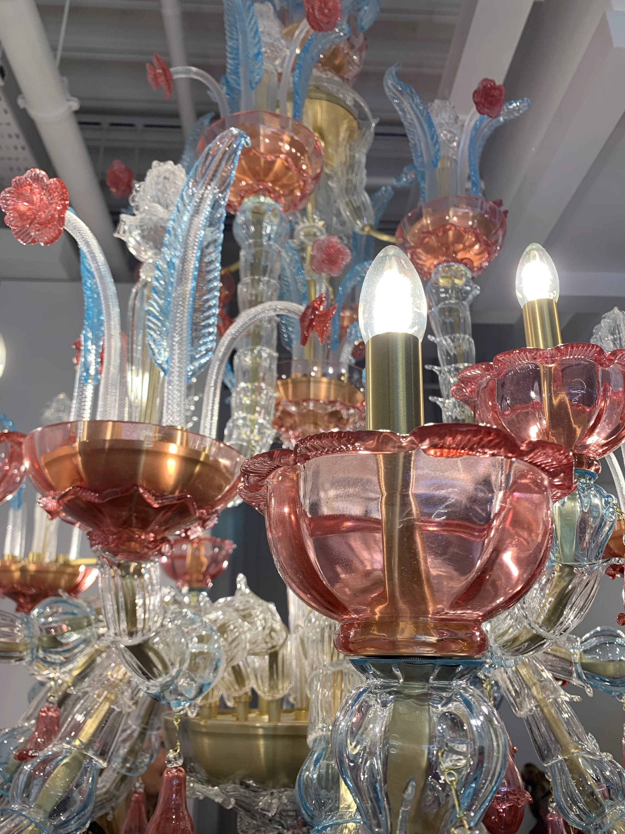
Here are just of the few delights that we discovered during our tour of the harbour-

So after an inspiring tour of the showrooms, being plied with alcoholic beverages on an empty stomach and laden down with bags full of lovely samples, catalogues and free pencils we then decide its time for a sit down in one of the exclusive eateries… and of course being the sensible adults that we are we order a glass of wine. 

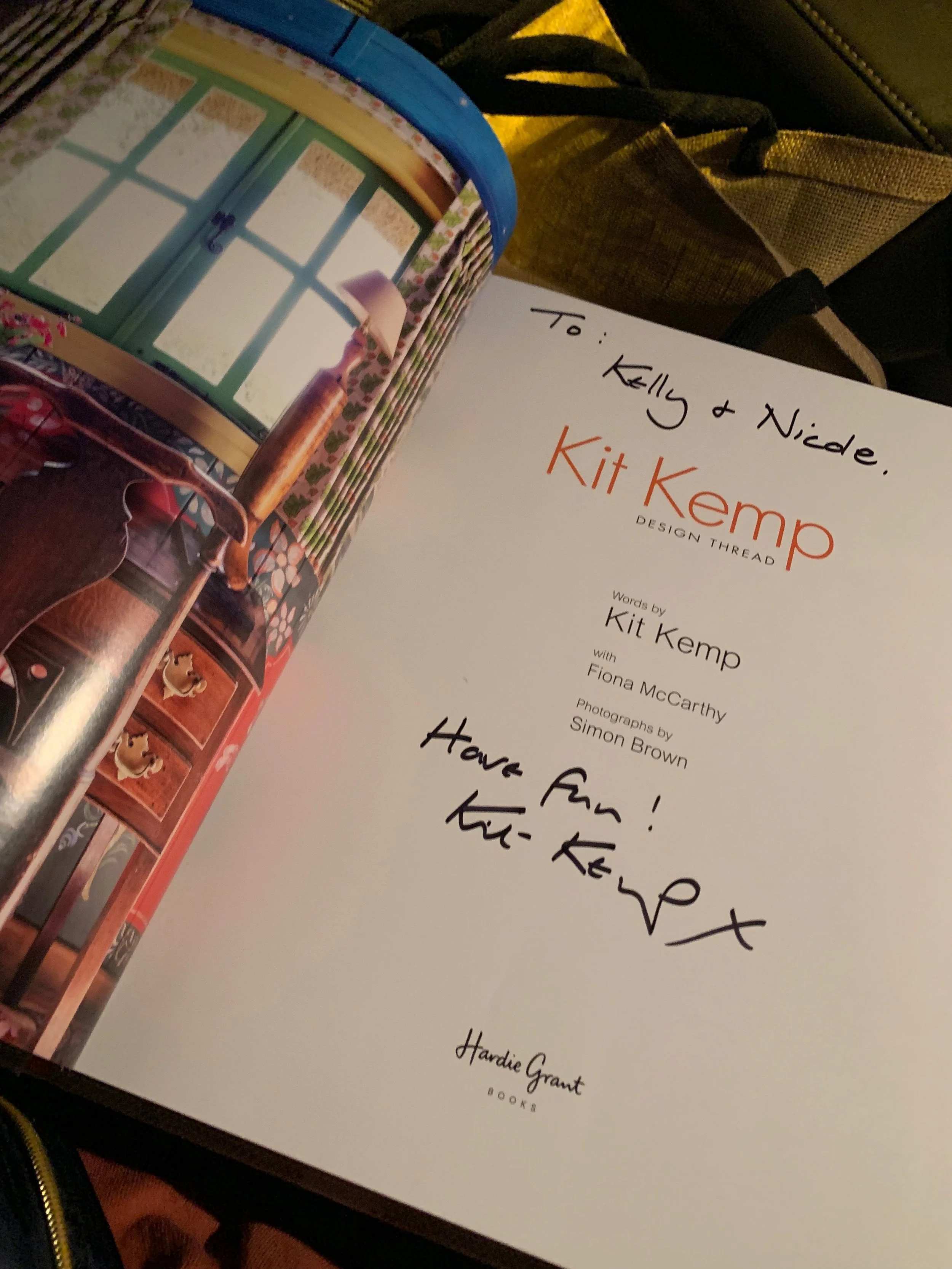
By now its almost 6pm & we are not quite ready to go home yet, we decide to try our luck at finding a seat in an already sold out talk by the fabulous ‘Kit Kemp’- We are in luck! Once everyone else is seated the lovely lady on the door kindly decides she can squeeze us in.  The talk by Kit was really inspiring, the work she has done is simply stunning, and it was great to hear how she became the Interiors legend that she is today and she even signed a book for us :-) 

Interior Designer Reading

All in all we had a fabulous day and can not wait to start using some of the inspiration in our next projects.  Until the next time #DesignWeek “it’s been fun”.

#LDW19AtDCCH #ChelseaHarbour #DesignWeek #InteriorDesign #Inspiration #OxfordshireInteriorDesigner #DesignEvents #InteriorDesignBlog #InteriorDesignReading #InteriorDesignHenley

5 of our most popular paint Colours by Farrow and Ball

Railings No 31 | Farrow and Ball

….More blue than black

A soft black with blue undertones

More blue than black, Railings is a softer alternative to black which is particularly suited to the ironwork it takes its name from. When used in Full Gloss on front doors it creates a handsome and commanding entrance, but becomes much more relaxed in feel in an Estate Eggshell finish. The bluer undertones of this dark hue transform rooms into dramatic and enveloping interior spaces.

Stiffkey Blue No 281 | Farrow and Ball

…The inky blue

An inky navy

This inky blue is named after the Norfolk beach where the mud, along with the cockles, share a particular deep navy hue. Although traditional in feel, Stiffkey Blue is often used as an alternative to Down Pipe to create a richly dramatic space with a more contemporary finish. When used in well lit areas of the home it will appear much bluer, working wonderfully when contrasted with Ammonite. 

Cornforth White No 228 | Farrow and Ball

…An easy neutral

An understated grey

Cornforth White is the mid tone in the group of Easy Neutrals which are totally understated and extremely versatile. Neither too warm nor too cool, Cornforth White sits contentedly between Ammonite and Purbeck Stone to create a hushed and calming retreat. Named in memory of John Cornforth, the revered architectural historian, contrast with Wevet to enhance its grey qualities.

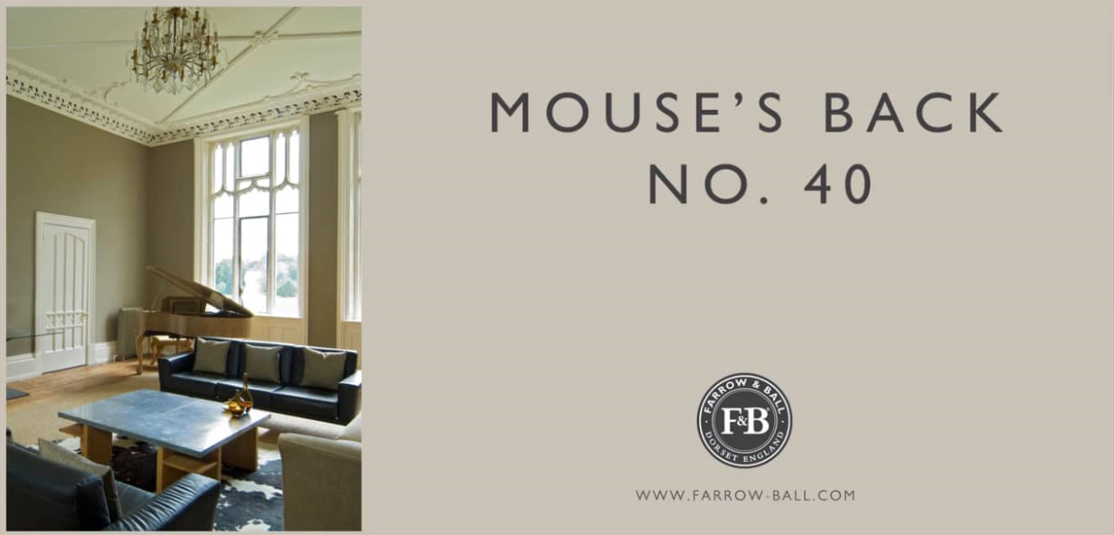
Mouse's Back No 40 | Farrow and Ball

…A classic grey brown

A quiet grey brown

This grey brown classic takes its characterful name from the fawny colour of the British field mouse. Much like its namesake, the green based Mouse’s Back is quiet in nature and feels soft in rooms both large and small. It will read greener when used on the walls of underlit rooms and is the perfect accent on furniture or floors when combined with more traditional shades such as Setting Plaster and Lime White.

Raddicio No 96 | Farrow and Ball

…Bright and contemporary

A modern crimson

This bright and modern red takes its name from the distinctive crimson leaves of Italian chicory. Although tempered with magenta, Radicchio contains less blue pigment than Eating Room Red so is brighter and more contemporary in feel. It confidently fills a room with energy without having the brashness of a true, clean red.

3 Questions you must ask an Interior Designer before hiring them

The process of hiring an interior designer may seem like a daunting task, will they be the right match? Are you both on the same wave length? How do you know if you will get on and be able to communicate with one another successfully?

It really does not have to be this daunting, if you know the right questions to ask when making an initial enquiry, and who knows you may just find the right one and become friends for life.

Interior Designer Berkshire | Interior Designs

initial enquiry…

The first step to finding the right designer for you!

Firstly you need to think about- How much involvement do you want in the project? and then ask the designer -How involved will I be in the design of the project?

Some designers do not welcome input from their client on this, especially the creative design, where as others will want to consult with you at every step of the way. The ultimate point to remember though is to trust and commit to the decisions that you have hired the designer to make for you, so do have a think about this before hand and bear this in mind from the offset.

Secondly ask the designer- What defines their style and where do they find their inspiration?

Interior Designer Berkshire | Interior Designs

Inspiration!…

Where do they find theirs?

This will give you a glimpse at their personality and what makes them tick, giving you a good idea of the type of interiors they are likely to create. You can always back this question up by asking them to tell you about a favourite project they have worked on previously and ask why they loved it so much. This will give a sure fire indication as to how they like to work for example if they say “because the client gave us a free reign to do whatever we wanted and did not get involved in any of the decision making, they simply left us to it” then you will know that this is the way the designer prefers to work.

Lastly always ask something regarding their project management style… The value of a good interior designer goes much further than simply having good style or a creative flair! Be sure to ask for example -How will they communicate their vision in a way that you will understand?

Interior Designer Berkshire | Interior Designs

Vision….

How is this communicated to the client?

Once you have agreed the design every designer handles the project management side of things differently, so it’s important to have a good idea as to how their design process works.

We hope you found this helpful please take a look at our style statement on our Home Page and our detailed break down on our Design Services page to find out more about Morris Molloy, our style and how we manage our design process.

Please do contact us via our Contact Us page if you would like to make an initial enquiry we would be happy to help and answer any questions that you may have.

Kelly & Nicole