We love it when Fashion and Interior brands collaborate! In the past more often than not it has been Fashion Designers that have turned their hand to Interiors however last Autumn we saw William Morris design a range of clothing for H&M and this Spring Superga and Farrow and Ball joined forces to create a brand new take on their 2750 Trainer and we just love the concept behind the design. Read on for more details….
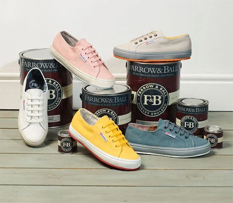
Farrow & Ball + Superga
Farrow and Ball have taken every detail into consideration creating unique colours that only appear on the collaboration shoes, the foxing has been designed to replicate a classic Victorian skirting board and the shoes are lined with Farrow and Ball’s best-selling wallpaper design – Tessella (WOW!)
Each shoe has been designed by Farrow and Ball in the same way they would construct a room, taking in to consideration the colour of the floor, which represents the sole, skirting board, representing the foxing and the walls, representing the canvas. Each colour has been mixed in-house by Farrow and Ball.
The shoes are branded with ‘Farrow and Ball’ replacing the usual ‘Superga’ rubber heel branding, with their logo featuring on the left sock lining and Superga on the right. How amazing is this?

Morris & Co + H&M
As previously mentioned Last Autumn, H&M collaborated with Morris & Co, the quintessentially British interiors brand that was founded in 1861 by William Morris, one of the most influential designers of the Arts & Crafts Movement. The collection featured some of the most recognised archival prints in romantic yet tailored designs. Sourced from its vast archive, the Morris & Co prints used throughout the collection are some of the most iconic often seen on wallpaper and interior textiles. Anyone who knows of William Morris will be able to spot his designs being worn on the high street, on the catwalk and even on screen.
Ok so we are not taking it away from the world of Fashion that they too have created some fabulous designs for some of our most loved Interior/homeware brands, such as the collaboration between Joules and DFS…
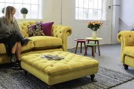
Joules + DFS
Yet another fabulous collaboration can be seen when British fashion and lifestyle brand Joules who are known for their use of floral prints, colour and stripes, extended their homeware range with the launch of its first-ever sofa collection in collaboration with DFS.
It includes a range of country, coastal and colour-inspired sofas, armchairs and footstools, with each piece designed to “embody the quality, Britishness, colour and humour that makes Joules stand out from the crowd,”
Each piece is made in the UK, and is available in array of fabric options and colours, and feature details such as colour-dipped feet, which we love!
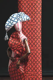
Vivienne Westwood + Cole & Sons
The last one we would like to shout out about is when the legendary Vivienne Westwood chose to take her designs from inside your wardrobe and onto the walls of your home. The designer's collaboration with Cole & Sons draws on her signature prints and patterns throughout her career, translating them into striking wallpaper designs.
"It is good when my ideas get carried over into other artistic media. This collection is a perfect opportunity to be able to work with a heritage company like Cole & Son and to see my ideas from fashion translated into the world of interiors and wallpaper," comments Westwood.
Here’s to many more fabulous collaborations in 2019 & beyond!